Game Boy Colour Palette
Four shades of green. This page lists every colour in the Game Boy palette used by the 8-bit photo converter, with hex and RGB values, explains where the palette came from and how the tool maps a photo onto it, and shows what it does to a real image.
Published 5 September 2026
- Machine
- Nintendo Game Boy (DMG-01)
- Released
- 1989 (Japan and North America), 1990 (Europe)
- Screen
- 160 × 144 pixels, reflective LCD
- Colours
- 4 shades of one hue
- Mapping in the converter
- By brightness, four fixed bands
Where the four greens come from
The original Game Boy did not really have a colour palette at all. Its screen was a monochrome liquid-crystal display that could set each pixel to one of four levels of darkness, and the panel itself had an olive-green tint. Nintendo chose that display because it was cheap, easy on batteries and readable in daylight, all of which mattered far more than colour for a handheld in 1989. The greenish look was a side effect of the technology, not a design decision, which is a nice reminder that a lot of what we now call "retro style" was simply what the hardware did.
Later hardware changed the tint. The Game Boy Pocket in 1996 switched to a greyer panel, and the Game Boy Color could apply real colours to old cartridges. But it is the original green that stuck in people's memories, and it is the version almost every emulator and pixel-art tool reproduces today. The four values used here are the widely adopted emulator approximation of that first screen, running from a near-black olive to a bright yellow-green.
The colours
Notice that every one of these has more green than red or blue, and the difference between the darkest and lightest shade is mostly brightness. That is what makes the palette feel like a single-colour photograph rather than a colour image, and it is why the converter treats it differently from every other palette on the site.
How the converter maps a photo to it
For most palettes the tool looks for the nearest colour in the list. Doing that with four greens would be pointless, because a red jumper and a blue sky would both land on whichever green happened to be closest, and you would lose the light and shade that actually describe the picture. So for Game Boy the converter works from brightness alone. It averages the red, green and blue values of each block to get a single level from 0 to 255, then splits that range into four bands:
| Brightness of the block | Shade used | Hex |
|---|---|---|
| 0 to 63 | Darkest | #0F380F |
| 64 to 127 | Dark | #306230 |
| 128 to 191 | Light | #8BAC0F |
| 192 to 255 | Lightest | #9BBC0F |
The bands are equal in size, which mirrors how the real screen quantised its four levels. It also means the result depends entirely on how light and dark your photo is, not on its colours. A dark red and a dark blue end up identical.
What it does to a real image


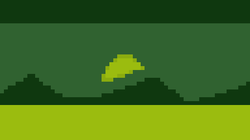
Two things stand out in the test scene. First, the five spheres, which are five different colours in the source, become almost the same object once only brightness survives, and you tell them apart by their highlights and shadows rather than their hue. Second, the smooth gradient sky becomes flat bands with hard edges, because a gentle change in brightness crosses one of the four thresholds all at once. Real Game Boy artists hid those edges with dithering, a checkerboard of two shades that reads as a third from a distance. The converter does not dither, so it tends to give you cleaner but flatter areas than a genuine Game Boy Camera shot.
Which photos suit it
- Portraits with clear lighting. Because everything is decided by light and shade, a face lit from one side keeps its shape well. Flat, evenly lit selfies turn into a single mid-green blob.
- High-contrast subjects. A dark silhouette against a bright sky is perfect. The four bands do the work for you.
- Anything you want to look like a Game Boy Camera photo. That 1998 accessory produced 128 × 112 pictures in exactly this kind of four-level greyscale. There is a whole guide to recreating the Game Boy Camera look if that is what you are after.
Photos that rely on colour to separate things, such as a green pitch with players in green and white kits, or a bowl of fruit, tend to disappoint. If the subject and background are similar in brightness they will merge.
Tips for better results
- Boost contrast before you convert. Even a small edit that darkens shadows and lifts highlights pushes more of the image away from the middle two bands and gives the result more shape.
- Keep the pixel size moderate. The palette already removes most of the detail, so a large pixel size on top of it can leave nothing to look at. Between 6 and 10 is a good starting point for a photo around 1000 pixels wide.
- Export as PNG and never re-save as JPG, which smudges the hard edges between shades.
- If you want the grey Game Boy Pocket look instead of green, convert with the Black & White option in mind: it gives two levels rather than four, so it is harsher, but it is the closest the tool currently gets to a grey four-shade result.
Try the Game Boy palette on one of your own photos. Free, instant, and nothing gets uploaded.
CONVERT WITH GAME BOY