NES Colour Palette
The 8-bit console palette. This page lists every colour in the NES palette used by the 8-bit photo converter, with hex and RGB values, explains where the palette came from and how the tool maps a photo onto it, and shows what it does to a real image.
Published 5 September 2026
- Machine
- Nintendo Entertainment System / Famicom
- Released
- 1983 (Japan), 1985 (North America), 1986 to 1987 (Europe)
- Screen
- 256 × 240 pixels
- Colours
- 64 hardware entries, 55 distinct usable colours
- Mapping in the converter
- Nearest colour by RGB distance
A palette defined by a TV signal
The NES never stored its colours as red, green and blue values. Its picture processor, the Ricoh 2C02, generated a composite video signal directly, and each of the 64 entries in its master palette was really a combination of a brightness level and a phase on the colour carrier. That is why you will find slightly different RGB versions of the NES palette in different emulators: they are all approximations of what a particular television would have shown. The values on this page follow the conversion used by most emulators and pixel-art tools, and they are the ones the converter uses.
The 64 entries include several duplicates of black and a couple of near-identical greys, which is why the palette is usually quoted as "54 colours" or thereabouts. The converter uses 55 distinct values: every usable colour plus black. It was missing the palest row until September 2026, and adding it made a noticeable difference to skies and skin tones, which used to be pushed into stronger, darker colours.
The colours
The palette is arranged in four rows of increasing brightness. Each row runs through the same sequence of hues, starting with a grey and moving through blues, purples, reds, oranges, greens and cyans. The first row is dark and muted, the second is fully saturated, the third is bright, and the fourth is pale, almost pastel.
What the console could actually show at once
Here is the part most "NES palette" pages leave out. Having 55 colours available did not mean a game could use them all in one frame. The hardware split the screen into background and sprites, and each of those could use four small palettes of three colours, plus one shared backdrop colour. That gives 25 colours on screen at once at most. Worse, every 16 × 16 pixel area of the background had to pick just one of its four three-colour palettes, so artists spent much of their time deciding which colours could sit next to each other.
| Layer | Palettes | Colours each | Total |
|---|---|---|---|
| Background | 4 | 3 + shared backdrop | 13 |
| Sprites | 4 | 3 (fourth is transparent) | 12 |
| On screen at once | 25 |
The converter ignores those on-screen limits and lets every block pick freely from all 55 colours. The result is more colourful than any real NES game ever was, but it is a faithful use of the palette itself, and that is the trade most people want when they are converting a photo rather than designing a level.
How the converter maps a photo to it
Each block of the downsized image is compared against all 55 colours and takes the closest one, measured as straight-line distance in RGB space. Because the palette has four brightness rows, this works a lot better on photographs than the smaller palettes do. Mid-tones have somewhere to go, and there are enough greens, blues and skin-tone oranges for a landscape or a portrait to keep its identity.

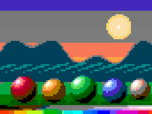
In the test scene the sky's gradient from blue to orange survives as three or four clean steps, and each sphere keeps its own colour. Compare that with the CGA version of the same image, where everything collapses into cyan and magenta. The NES palette is the one to reach for when you want a photo to still look like the photo.
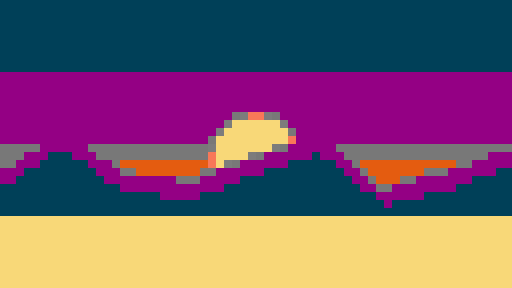
Which photos suit it
- Portraits. The pale row includes a run of peach and cream tones that map skin reasonably well, and the darker rows handle hair and shadow.
- Landscapes and skies. There are more blues and greens here than in any other palette on the site.
- Anything busy. If a scene has lots of different colours, this palette keeps them apart instead of merging them.
Where it is weaker is subtlety. The NES palette has no true browns or olive greens, so wood, sand and autumn leaves tend to swing towards orange or towards grey. It also has only two real greys between black and white, so a monochrome photo can look a little stepped.
Tips for better results
- This is the palette that tolerates the smallest pixel size. Because it keeps detail well, you can go down to 4 or 6 on a large photo and still get a convincing 8-bit look.
- If skin looks too orange, warm the photo slightly less before converting, or try PICO-8, whose peach tones are gentler.
- For an authentic "game screenshot" feel, aim for a final image around 256 pixels wide, which you can do by picking a pixel size equal to your photo's width divided by 256. The pixel size guide walks through the maths.
Try the NES palette on one of your own photos. Free, instant, and nothing gets uploaded.
CONVERT WITH NES